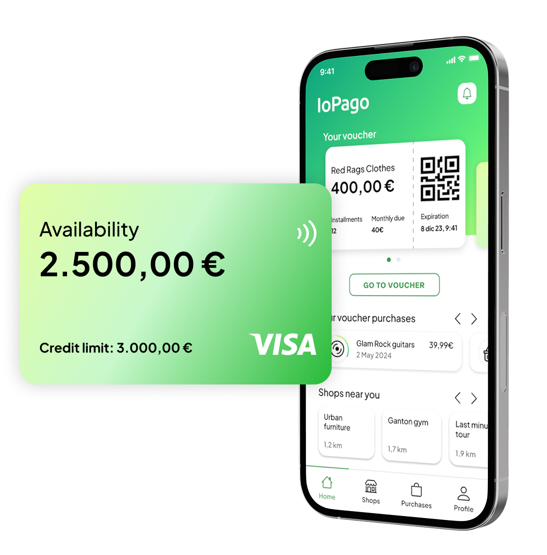
IoPago

Integrating new financial products in a buy now pay later app
Finance & credit
UX design
Co-design
My role
UX/UI designer
Timeframe
3 months
Team
  • 1 Project manager
  • 1 Solution architect
  • 2 UX designers
  • 1 UI designer
  • 4 Developers
Tools
  • Figma
  • FigJam
  • Google suite
  • Microsoft Teams
  • Agile workflow
This is an anonymized project
Names and brand identity have been anonymized to address privacy concerns

Overview

Implementing credit card features into a buy now pay later app
Context
Busso is a finance company established in Italy. Its core business is providing credit for consumers for a wide variety of use cases.
IoPago app: Busso entering digital BNPL
IoPago is an app that has been developed recently to give its users zero interest loans for paying in stores, with a buy now pay later model similar to Klarna and Scalapay.
Problem statement and requirements
While doing maintenance of the existing app, it is required to add a new product: a credit card that let users divide payments into installments. This card won’t be free and some eligibility conditions have to be met by users.
Photo by Igg Love on Unsplash

Process

From ideation to implementation, in close collaboration with legal and dev teams
Exploration phase
1
Ga­the­ring and de­fi­ning re­quire­ments
2
Cus­to­mer Jour­ney map­ping
Design phase
3
Lo-fi
wire­framing
4
Hi-fi
wire­framing

Customer Journey mapping

Mapping all segments of users to identify improvements
First step was identifying different segments of users:
Prospect
users

People that have never been Busso’s clients and never downloaded IoPago

New
customers

People that are Busso’s clients, but don’t know about IoPago app and services

Eligible
customers

People that are Busso’s clients with qualified past payments

Temporary ineligible
customers

People that downloaded IoPago but never made a payment
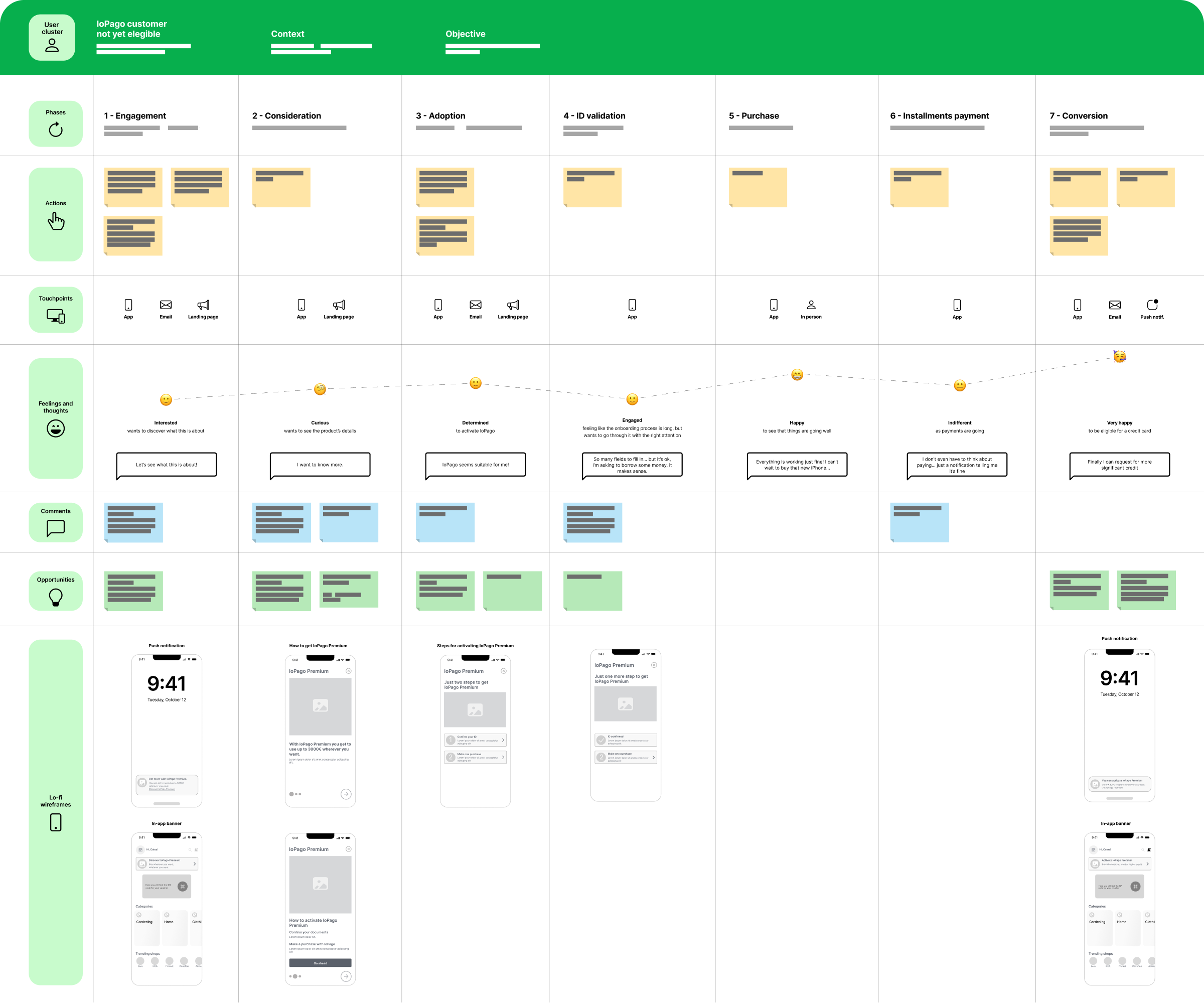
Customer journey were then mapped for each segment with the to be experience in mind, including as is phases inherited from the existing app.
An example of one of the customer journeys mapped.

Mapping through segments revealed all the complexity for each type of user. Special importance was given to early stages of the CJ and how the already existing flow would integrate.

High level wireframes were embedded into the customer journeys to give tangible examples when sharing to all stakeholders (product owner, managers, developers) during extensive validation meetings, contextually finalizing the product’s specifications.

Lo-fi wireframing

User flows taking shape

Wireframes were jot down following all use case emerged from customer segments. All corner cases were covered, using a user flow-like representation that set out clearly conditions and error states.
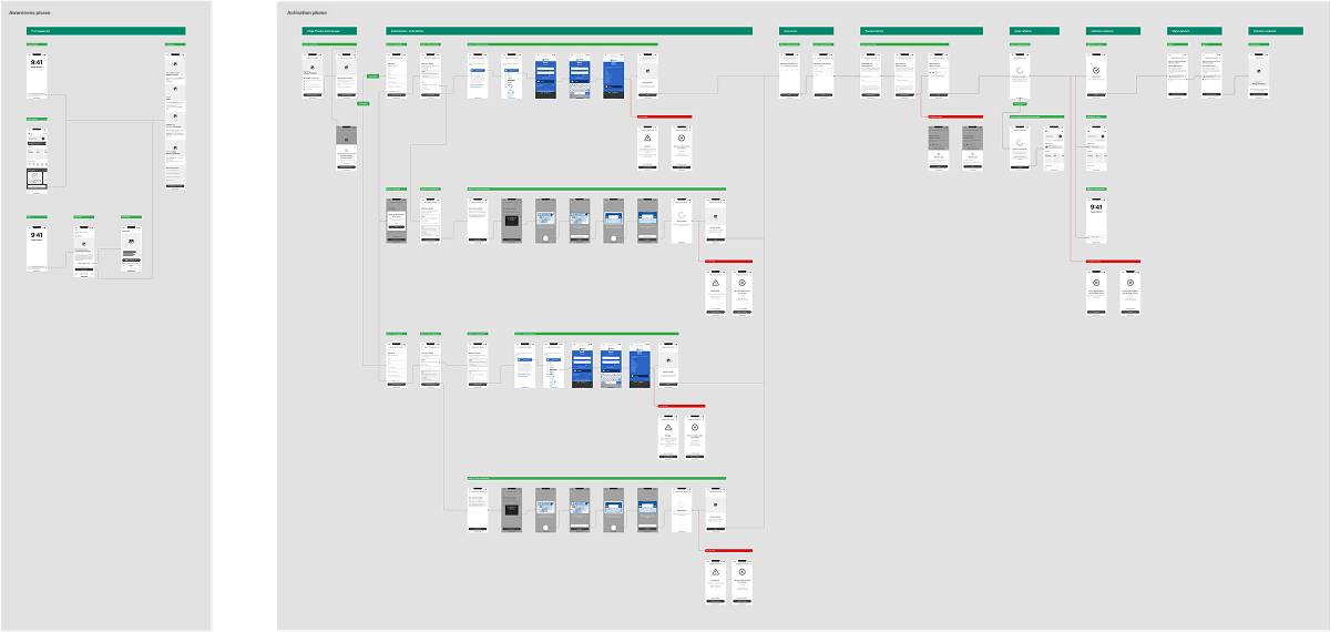
Partial representation of the wireframes for the Awareness and Activation phases.

Cyclical reviews were made in order for the design to respect back and front end limitations as much as meeting compliance requirements.
Hi-fi wireframing
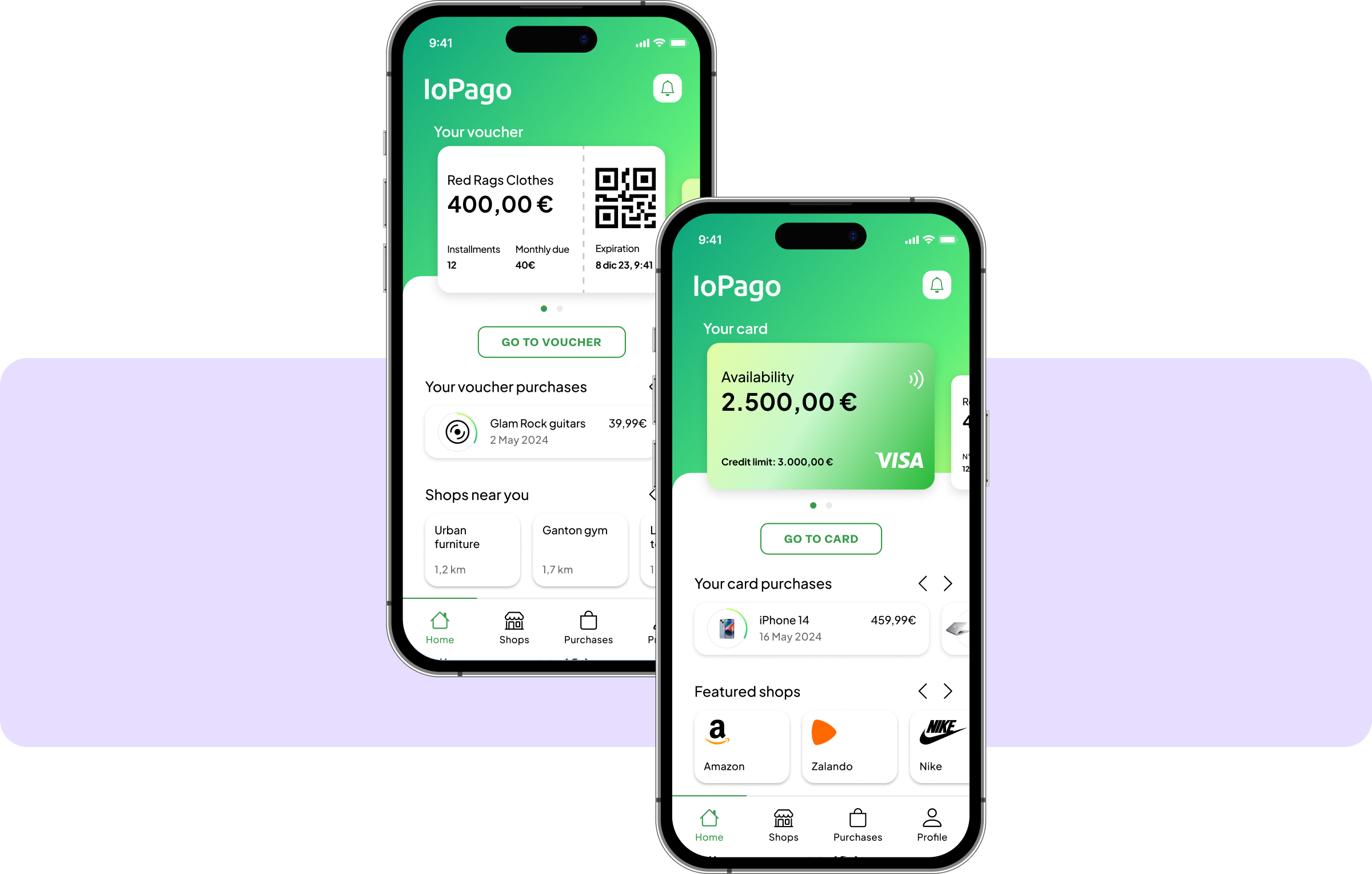
The final UI
One important step was differentiating the free-to-use buy now pay later service, which used a qr code system to pay in stores, from the new credit card product, since they had the same naming. We achieved it in the homepage in the first place, by using a carousel which let people switch from the qr code to the card, contextually changing functionalities.

What I learnt

Interacting with the whole team using an agile methodology was one of the key learning, as communicating regularly with developers. One important UX-related skill I learnt were tackling product complexity, creating clear product communication and overcome technical limitations.
Do you want to see more?

Previous project
Despar Tribù
Planning an UX strategy and co‑designing a mass retail chain store app